Challenging the middle-class comfort zone
06 July 2018 | Story Supplied. Photo Ken Teegardin. Read time 4 min.
With inequality so commonplace in South African society that it barely raises an eyebrow, University of Cape Town (UCT) economists developed a new income comparison tool to jolt people out of their middle-class comfort zones.
Some of the most distinctive features of inequality, they said, have been reduced to something of a “new normal”. This means that while the subject is often up for discussion, no one’s moving any closer to finding a solution.
It is against this background that the UCT’s Southern Africa Labour and Development Research Unit (SALDRU), based in the School of Economics, began investigating a way to change the status quo.
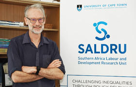
SALDRU’s director, Professor Murray Leibbrandt, said that understanding the nature and extent of the problem in South Africa – the country with the worst income inequality in the world – becomes easier when people are handed a way to get up close and personal with the issue.
“The question is whether people would still regard our level of inequality as acceptable or normal if we plotted it on a graph.”
Graphic evidence
The new tool helps South Africans see where they are located in the country’s income distribution by entering information about their incomes and their family size.
“[Would] people still regard our level of inequality as acceptable or normal if we plotted it on a graph?”
“It is designed to help people see themselves in South Africa’s story. By making the story about the person who interacts with the tool, SALDRU hopes that every South African who engages with it will reflect on where they fit in the bigger picture, and consider what role, if any, they may play in changing the status quo,” Leibbrandt explained.
It is intended for personal use and understanding, and SALDRU does not collect or save the information submitted via the online tool.
He said there is a tendency for South Africans to keep uncomfortable discussions about inequality at arm’s length, so the tool is a way to challenge their perceptions about the society in which we live.
“Middle-class South Africans may be surprised to see how privileged they are compared to the rest of the population,” Leibbrandt suggested.
Although SALDRU has conducted surveys and collected income data for decades, even the economists were shocked at the glaring disparity when they plotted the country’s income equality on a graph.
Shocking figures
“It’s quite devastating and challenging to be able to visualise the fact that 79% of the country’s population live in households where the per capita income is lower than the minimum wage of R3 500,” he said.
“It’s quite devastating and challenging to be able to visualise the fact that 79% of the country’s population live in households where the per capital income is lower than the minimum wage of R3 500.”
This daily reality for the majority of South Africans means that an enormous share of the country’s income accrues to the best-off 10% of the population.
Leibbrandt argued that this measurement is just the start.
“The point about drilling into the data is to allow citizens to reflect on the texture of our society, and how it works to distort the potential of our citizens in many ways,” he said.
Access SALDRU’s income comparison tool...
 This work is licensed under a Creative Commons Attribution-NoDerivatives 4.0 International License.
Please view the republishing articles page for more information.


