Wamkelekile, Welkom
COVID-19 dashboard ‘by and for South Africans’
17 April 2020 | Story Carla Bernardo. Read time 5 min.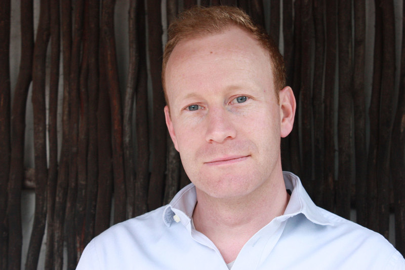
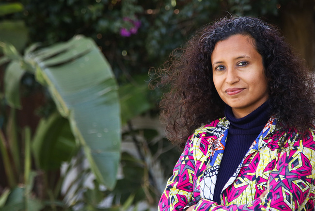
When South Africa confirmed its first positive case of Coronavirus Disease 2019 (COVID-19), University of Cape Town (UCT) doctoral candidate in computational neuroscience Leen Remmelzwaal was in Switzerland visiting family. On returning to Cape Town, he was shocked by how little data was available to the public and by the amount of misinformation online.
“People wanted to know what was going on, but it was difficult to get a comprehensive overview of the official data. New articles were providing bits and pieces of information but not drawing a complete picture,” he said.
Initially, Remmelzwaal got to work on an Excel spreadsheet, charting the number of cases since the first confirmation and shared it with his family who began requesting daily updates. He soon realised that it would be a lot easier to maintain and share the updates with a web-based dashboard. With the broader public’s need for information, the dashboard which was initially intended for his family soon evolved into a simple and intuitive website: COVID-19 Stats SA.
“This is intended to be a public resource, created by South Africans, for South Africans,” said Remmelzwaal.
Unbiased visualisations
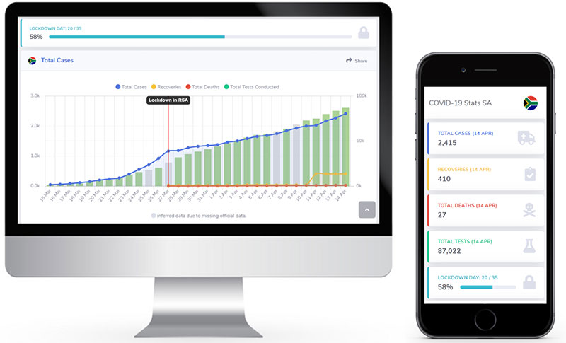
Launched on 23 March, COVID-19 Stats SA is a free-to-use, mobile-friendly public resource with a responsive user interface. Within just two weeks of its launch, the site was already boasting an average of 1 500 unique visitors (UV) per day; by the Easter weekend, it had reached 3 000 UVs per day.
“I aim to keep the data honest and clear. There will be no speculation or false information.”
With the dashboard, Remmelzwaal is providing South Africans with unbiased visualisations of the latest data on the spread of the virus, including a provincial breakdown, comparisons to other countries, projections and crime statistics.
All data is drawn from sources such as the South African government and Reserve Bank websites. In the interest of transparency, all sources of data are listed under each chart.
The website is also entirely free of advertisements, which is how Remmelzwaal hopes to keep it.
“I aim to keep the data honest and clear. There will be no speculation or false information,” he said.
The build
The first iteration of the dashboard took Remmelzwaal, who is an experienced web-based software developer, six hours to build and launch. He described the process: he used a shared Afrihost Linux server, the Bootstrap SB2 Admin HTML template, visualising the data using Chart.js JavaScript libraries, and using PHP to run the back-end calculations. User experience is designed for both desktop and mobile because 90% of the traffic has come from mobile.
“Any software developer or data analyst can now build their own dashboard by pulling data from corona-stats.co.za, free of charge.”
Remmelzwaal described the website as lightweight – the HTML page is less than 130 KB, thus minimising data costs on mobile devices and making it more accessible to the public.
In addition to the dashboard for the public, Remmelzwaal has also recently launched “a historical and real-time” data application programming interface for South African COVID-19 data.
“This means that any software developer or data analyst can now build their own dashboard by pulling data from corona-stats.co.za, free of charge,” he explained.
Remmelzwaal goes into further detail in an article he posted on his LinkedIn profile. He also invites other data scientists to share the visualisations they’ve created, and which are beneficial to the public, so he can add it to the website.
Feedback
One of the reasons Remmelzwaal decided to create a web-based dashboard was because it simplifies daily updates. It also allows him to receive valuable user feedback, which is often sent via the site.
“I strive to respond to every user comment and I build new visualisation tools for the users,” he said.
According to Remmelzwaal, a product is “only as good as the team that supports it”, so he is thankful for users’ valuable feedback. He also makes special mention of two UCT alumni who have been invaluable in their assistance with official data collection: Mimi Thurgood and Kristen Thompson.
Now, Remmelzwaal is asking users to share the public resource with friends and family and to continue making suggestions about what they’d like to see on the site.
“This is a tool for South Africans, and I will continue to strive to produce visualisations that are easy to understand, grounded in official data and free of any bias.”
 This work is licensed under a Creative Commons Attribution-NoDerivatives 4.0 International License.
Please view the republishing articles page for more information.


Highlights from 2020
As we look back on 2020, we celebrate some of the stories that were popular with readers of the UCT News website during the year.
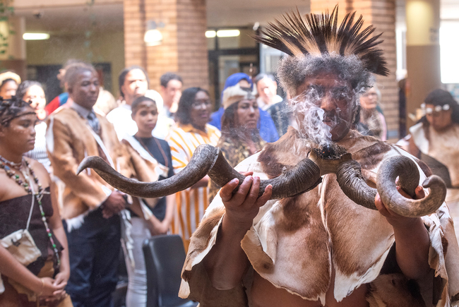
UCT marked a historic moment on its journey of transformation when it launched the Khoi and San Centre on 21 September.
11 Jan 2021 - >10 min read Highlight from 2020
In September, over 30 members of the UCT community were honoured in the Mail & Guardian 200 Young South Africans list.
08 Jan 2021 - 9 min read Highlight from 2020


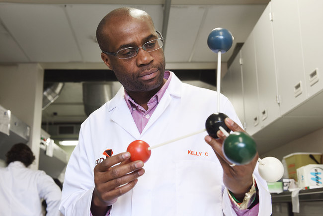
In April, UCT’s Professor Kelly Chibale was chosen as one of the world’s top 60 inspirational leaders in the pharmaceutical industry.
23 Dec 2020 - 7 min read Highlight from 2020

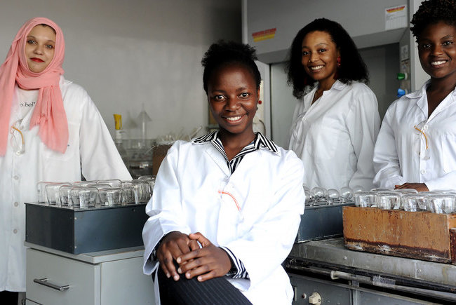
In April 2020, women took four of the five top spots in the final-year civil engineering class, a salute to excellence and a spur to equality.
22 Dec 2020 - >10 min read Highlight from 2020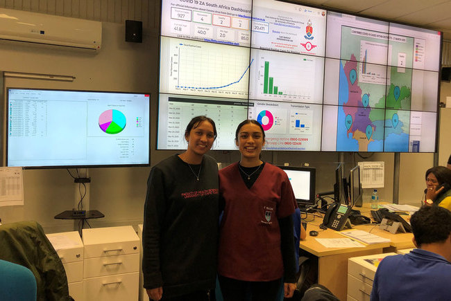

The Mamokgethi Phakeng Scholarship was launched in 2020 to support young black women in STEM fields of study at UCT.
21 Dec 2020 - 9 min read Highlight from 2020