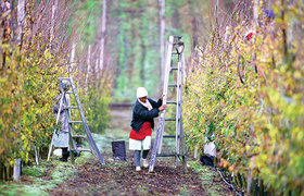
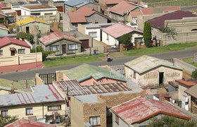
Wamkelekile, Welkom
Join the dots
22 September 2014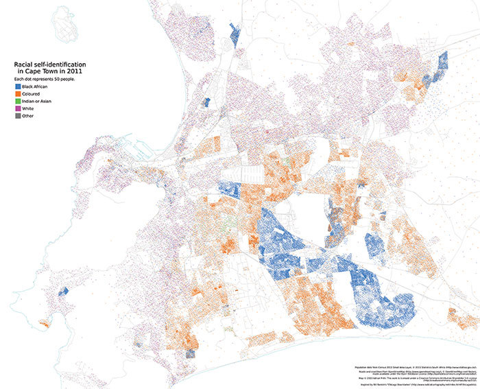
When Adrian Frith, database manager for the National Income Dynamics Study (NIDS) in the Southern Africa Labour Development Research Unit, began making dot maps, he had little idea how much interest they'd elicit from the public and the media.
(Please click on map for higher-resolution image)
Dot density or dot distribution maps rely on a visual scattering of dots to show spatial patterns. Mostly, Frith's maps have used demographic data (such as language, race or income) from the 2011 census to show trends and movements in an innovative way. It's easy for non-experts to understand – and the dots tell some interesting stories.
One surprise from Frith's dot map for language distribution, for example, is the "incredible" diversity and jumble of languages in urban areas such as Alexandra in Gauteng.
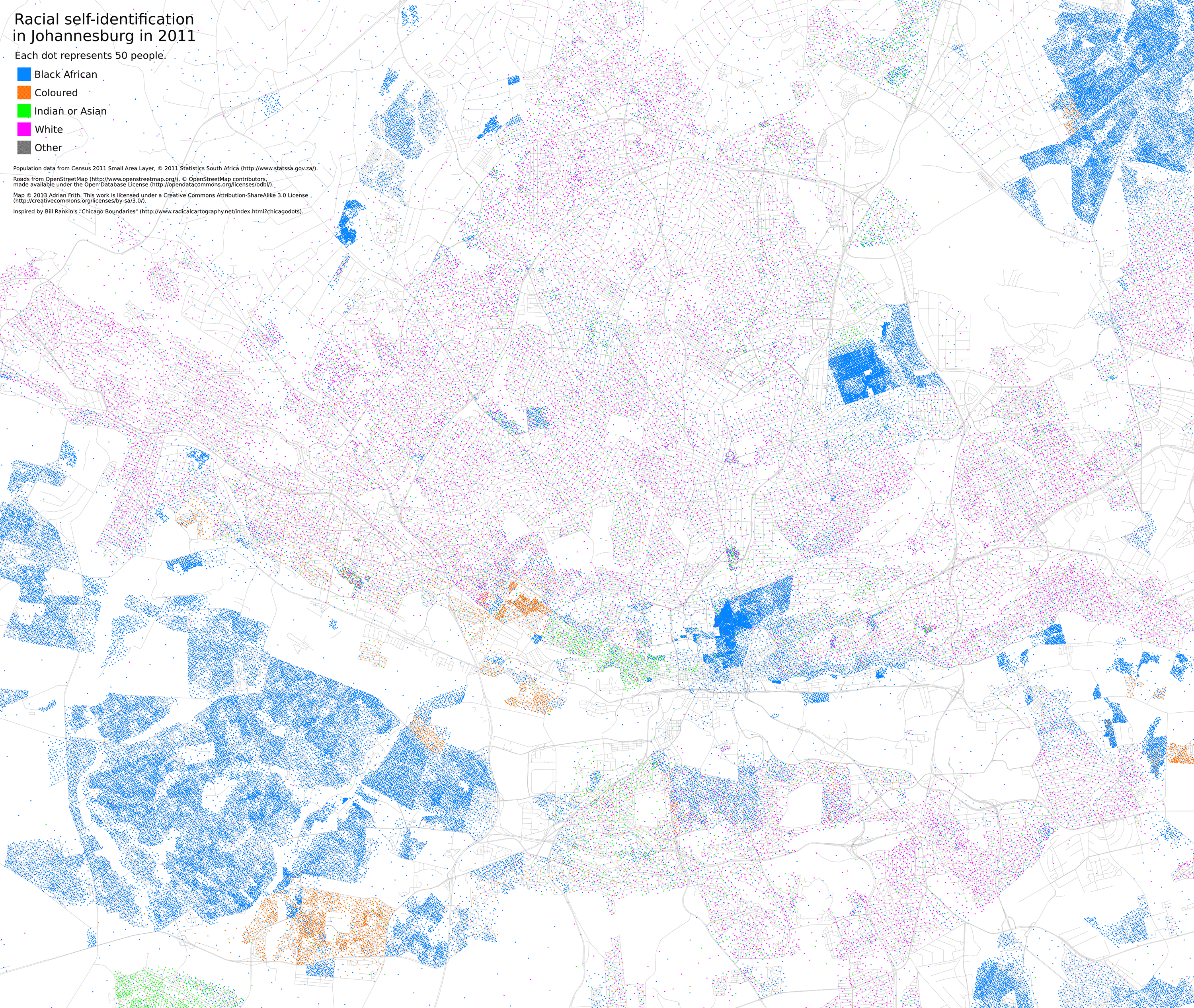
(Please click on map for higher-resolution image)
While not a new concept (for example, John Snow used a dot map to show clusters of cholera cases in the 1854 London epidemic), dot maps are being used innovatively by people such as policymakers, sociologists and urban designers to pick out nuances and shifts that may not have been discernible before.
It's an interest that stems from Frith's student days. Inspired by Bill Rankin's 2009 dot-distribution map of Chicago, Frith says he was spurred to create the same kind of map for South African cities.
Rankin's Chicago Boundaries challenged ideas of homogeneity in ethnicity, class, language and income, showing where and how lines had become blurred in the city, and the kinds of urban transitions that had taken place.
Dot maps have been described as "radical cartography". In some contexts, Frith agrees.
"In the specific context of ethnicity in America, dot-distribution maps can be described as 'radical' because they reveal the extent of segregation in American cities to a viewing population that was perhaps unaware of just how stark that segregation is. The South African context may be different, because South Africans are perhaps more aware of just how heavily our cities are segregated."
On a technical level, Frith continues, dot maps can be seen as 'radical' because the modern use of geographical information systems (GIS) software had driven most mapping towards the basic choropleth map.
These are thematic maps where statistical variability – for example, in population density or household income in a region – is shown by shaded or patterned areas. This is easy to produce with a GIS. Dot-distribution maps are more difficult to produce, but also much more revealing for some types of data.
Other dot maps made by Frith include one showing electrification throughout the country, and another showing party gains and losses in the last elections.
Who else might find these dot maps useful?
"Well, anyone who wants to get a feel for the demographic characteristics of an area might like them. For analysis, researchers would need to turn to the original census data to get the actual numbers."
Story by Helen Swingler
All maps available at www.adrianfrith.com/projects This work is licensed under a Creative Commons Attribution-NoDerivatives 4.0 International License.
Please view the republishing articles page for more information.