It still takes 45 minutes for a person of "average" height to go past, and after 50 minutes, we are in a world of giants. "Inequality," writes Wittenberg, "hasn’t budged since the end of apartheid." In fact, it may be worse. One of the biggest drivers of persistent inequality is unemployment, as Southern Africa Labour and Development Research Unit (Saldru) director and REDI3x3 co-ordinator Murray Leibbrandt points out. The unemployed do not even feature in the 2012 "march". If so, they would be infinitesimally tiny.
Measuring by the tax data, the high incomes could be even higher than previously thought, lifting the Gini (in earnings) from 0.59 to 0.62, says Wittenberg.
Careful measurement, says Leibbrandt, is critical if researchers want to produce credible analysis to support evidence-based policy making.
Wittenberg and Andrew Kerr from DataFirst and Saldru are key among REDI3x3 researchers in producing, with Statistics SA, a publicly available data set known as the Post-Apartheid Labour Market Surveys (Palms) — a compilation of 50 data sets comprising several million records since 1993.
Using Palms and the tax data, they have been able to measure inequality more accurately, and also uncover its nuances.
The tax figures are important because it is harder to hide true earnings than in an income survey where top earners are usually shy or forgetful. Even asset indices, a common way of measuring inequality, are suspect: in the international Review of Income and Wealth, Wittenberg and Leibbrandt write that in one survey, cattle and donkeys were given negative values, an assumption that not only wipes out a chunk of rural wealth, but makes — on paper – those who own livestock poorer than those who own nothing.
So measurement is hard. But with the right tools, it has been possible to uncover some trends about earnings inequality that are staggering.
Perhaps the main one is that the median wage has hardly budged since the end of apartheid. But the top end has moved away from the median, while the bottom end has moved towards it.
Minimum wage legislation may explain the rise of the bottom end. But why the top end has rocketed is a puzzle.
One explanation is the "superstar" theory — when, say, a football player is paid at stratospheric levels. But Wittenberg says top incomes are rising in sectors where there are no "superstars" — corporate or accounting firms, for instance.
People employed in the public sector have generally done better than those in the private sector. Public sector employment has increased steadily since 2000, reaching 2.7-million people two years ago, or 18% of total employment.
Wittenberg and Kerr examined occupationally similar positions in the private and public sectors and found that at almost every rung — except at the very top — public sector workers earned more.
What do median earners look like?
They are most likely African or coloured males in their late 30s, more educated than their counterparts in 1994, less likely to be unionised, in the private sector and more likely to work in trade than in manufacturing.
"They are positioned," says Wittenberg, "in areas where state intervention is least likely to help." Public education, a potentially significant state intervention, has been possibly the greatest disappointment of the democratic era.
"Instead of being the great equaliser we expected it to be 20 years ago," says Leibbrandt, it is the biggest driver of intergenerational inequality.
Leibbrandt has a graph that plots the relationship between the earnings of fathers and sons. It looks like the cliff at the start of a skateboard ramp — it tapers in the middle and rises again at the end, although not as sharply.
It depicts Intergenerational Earnings Elasticity, a measure of how closely your earnings match your parents’.
The steep cliff at the start shows that if your father is in the bottom decile (the poorest 10%), the likelihood that you will be there too is 95%. The relationship is less pronounced towards the middle and higher again at the top — if your father was/is wealthy, there is an 85% chance that you will be.
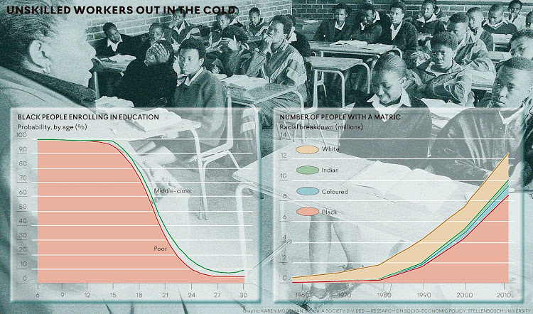
The other key graph is on education, produced by the socioeconomic policy research team at the University of Stellenbosch. It shows the opposite of the skateboard ramp.
It’s a low, meandering curve that rises steeply towards the right side and illustrates what economist Rulof Burger calls the "convex returns to schooling".
In other words, as years of schooling have increased, the returns in the labour market have become more unequal. It doesn’t matter whether you have one or five or nine years of schooling in terms of the wage you can expect. The big differences are made by matric, but especially tertiary education, when earnings shoot up.
About half of those who start school don’t make it to matric. As the demand for unskilled labour falls, these young people — despite having more education than their parents — are worse off in terms of occupational mobility.
There is a justifiable clamour in the political space. Those who should be focusing on policy interventions to give the postapartheid generation new hope are instead mired in battles over corruption and state capture.
That battle is critical. But so too is a keen focus on inequality, its causes and human consequences. Otherwise the march of the "dwarfs" will reverberate in even more painful ways.
The Research Project on Employment, Income Distribution and Inclusive Growth (
REDI3x3) is a national research programme aimed at deepening understanding of the dynamics of employment, incomes and economic trends. By focusing on the interconnections between these three areas, the project seeks to contribute to policy reforms and development strategies that will address South Africa's unemployment, inequality and poverty challenges.
This article was first published on BusinessDay Live.