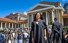
Wamkelekile, Welkom
What the coat of arms reveals about us
23 September 2015 | Story by Newsroom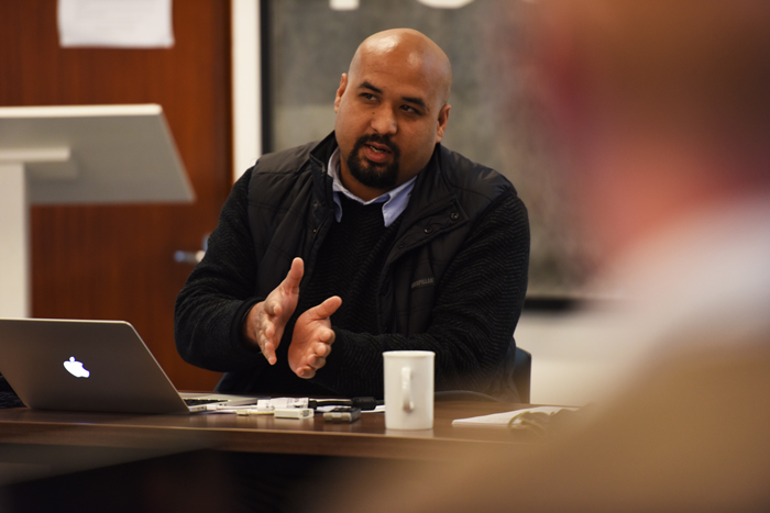
How do we define a 'South African culture' and heritage, and how might this be expressed in coats of arms and the fonts we type in? Kurt Campbell, lecturer at the Michaelis School of Fine Art, posed these questions at a recent HUMA seminar on 10 September, in his talk titled 'Politics of the Sans Serif'.
After 1994, a number of font foundries and design companies were charged with creating a new coat of arms for the post‑1994 democratic dispensation, said Campbell. This coat of arms would need to represent a unified vision of addressing historical injustices
The coat of arms from 1910, when South Africa changed from a colony to a union, was an absorbing case study for the scholar.
“What was really interesting about that coat of arms was that it was quite dense in terms of the information it conveyed.” As it came from a British 'parent', Campbell also found interesting the aspects of British/South African culture, as it was then starting to form, that were chosen to be represented.”
For instance, said Campbell, the shield was a very clear link to “a kind of British heraldry system”. Then there was the gemsbok and an ox wagon, “which was part of the Great Trek”.
“There's debate about the orange tree,” he said. “Some people say it's a direct reference to what was then the Orange Free State, which was a new province in what was then becoming a new province in the Union of South Africa.”
No serifs!
What piqued Campbell's interest in particular was the roughly translated Latin at the bottom of the coat of arms, which reads as “There's strength in unity”.
That was the debate's entry into the serif, which is the expressive annunciation attached to the end of a stroke in a letter or symbol, which scholars furiously argue originated from artists' brushstrokes and not chisels, and vice‑versa.
“What was fascinating,” said Campbell of the thought behind the post‑1994 coat of arms, “was this idea of remaking the nation through typography and through heraldry − and of course letters play an integral part in how a certain motto or a certain vision for South Africa could operate.”
Key to this new national identity was the insistence that a san serif font (one without any serifs) be used.
Parliament, designers and typographers debated what would represent everyone on a new coat of arms.
“What was foregrounded on the coat of arms was a group of people that are under threat, the San.”
The language that you see there is actually nearly extinct – there are only three speakers left.
“Thabo Mbeki, in his I am an African speech, refers to the San people as the first victims of genocide in the country, and said that we need to put them at the centre of our vision going forward so that we don't repeat the same mistakes.”
In place of the gemsbok, elephant tusks are seen on the left and right of the crest.
“You see our country's agricultural prowess with the corn or wheat represented; you see the assegai and knobkerrie that are crossed, instead of the 'conventional' blade and shield; and you see the secretary bird and the rising sun.”
In terms of typography and writing system there was disagreement; people objected to a serif typeface being used in the crest because it was seen as being a heavily loaded.
“It was a very interesting move. Again, it has colonial associations, and using a serif typeface was seen as an unthinking choice.
“Even though the new crest was meant to be a complete break from the past, there were a lot of red herrings and mistakes that crept in,” Campbell said. “In my view, there was also an unthinking use of typefaces that also became national policy.”
The government issued a brand identity manual with the crest, so that every communication between government departments would have to follow certain protocol. Only two fonts were now allowed, and all departments had to use uniform branding.
“It's not uncommon in other countries, but for us it was quite a big thing; it was a very 'sexy' moment, if you'll pardon the language.
“Surprisingly, shockingly, the company that got the commission went for the absolutely bizarre choice of saying that Gill Sans and Arial would be the only typefaces permitted and would be the typefaces that most elegantly conveyed the vision of our new democracy with an Africanist focus.”
Gill Sans, Campbell wryly observed, was the font famously used for the BBC's logo.
“It's seen as the quintessential British typeface,” he said. “It's become a ubiquitous typeface that has a very strong national association with Britain.”
The other “knockout font in [the brand guideline's] arsenal” is Arial. Arial, he said, was problematic on a number of levels. For a start, it was designed to be invisible, as it were.
“It was not designed to be a performative font that's meant to have a cultural legacy or baggage. Secondly, it's the font that IBM uses, which is an international business conglomerate, which is also bizarre.”
Campbell argued that there was “a very, very rich heritage of writing systems and innovation in Cape Town”, specifically. Palaeologists and typographic scholars talk about Africa as a continent that, although it has pictograms, has no writing culture.
What is the South African culture?
“A lot of the research that I did talks about quite the opposite,” said Campbell.
“After 1994, we had 'cultural explosion'. People were asking, 'what is the South African culture?'. If it was very important for us to rush to a position before as an Englishman, as an Afrikaner, as black, what do we call this culture and how do we express it in typographic terms and in terms of broader based images and text?”
The new coat of arms deliberately didn't use the serif, because sans serif is seen as a neutral gesture.
“We cannot think of typography as merely an instrumental thing. It doesn't just do a job. There's an undeniable social aspect to typography, not only because it is inherently there, but because we want it to be so,” said Campbell.
Story by Yusuf Omar. Photo by Michael Hammond.
 This work is licensed under a Creative Commons Attribution-NoDerivatives 4.0 International License.
Please view the republishing articles page for more information.