Wamkelekile, Welkom
UCT researcher’s COVID-19 dashboard expands globally
27 May 2020 | Story Nadia Krige. Photo Adobe Stock. Read time 7 min.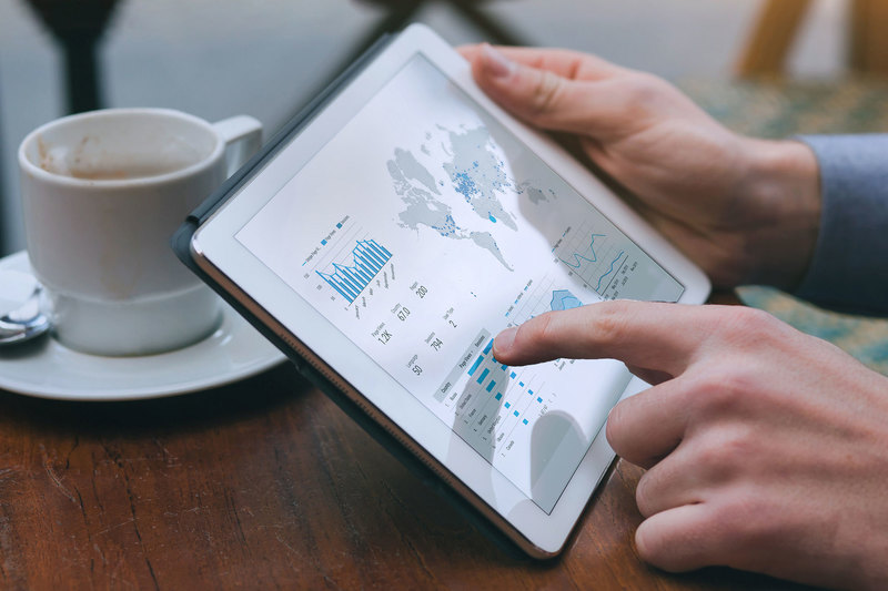
When confronted with crisis, it is often the simple solutions that resonate most deeply with people. Leen Remmelzwaal, a PhD candidate in computational neuroscience at the University of Cape Town (UCT), discovered this first-hand when a dashboard he designed to offer South Africans a comprehensive overview of the latest coronavirus statistics started gaining international traction.
Born out of a personal need for a deeper understanding of how the virus was developing in South Africa, Remmelzwaal’s project started as a humble Excel spreadsheet logging COVID-19 case numbers, which he shared with family and friends.
However, he soon noted a general sense of confusion and fatigue among South Africans – driven, on the one hand, by a lack of reliable, unbiased information and, on the other, an overload of misinformation.
With his natural affinity for technology, Remmelzwaal decided to come up with a basic online platform that would offer a one-stop, easily accessible visual dashboard of the latest South African coronavirus statistics.
“I really wanted to get a sense of where we were heading, what our trajectory looked like and if we were getting better,” he explained. “The way I wanted to do that was through some basic visualisations.”
“I love the challenge of making something amazingly efficient while keeping it really simple.”
Using a shared Afrihost Linux server, the Bootstrap SB2 Admin HTML template, Chart.js JavaScript libraries for visualisations and PHP to run the back-end calculations, he created a lightweight web page that was mobile-friendly and wouldn’t require a large amount of data to access.
Within six hours, he was ready to launch and so the first iteration of Corona Stats (formerly COVID-19 Stats SA) saw the light of day on 23 March 2020.
“I’m always drawn to simplicity. I love the challenge of making something amazingly efficient while keeping it really simple,” said Remmelzwaal. “Which is exactly what I was aiming to do with the dashboard.”
Within the first two weeks of its launch, the site was already boasting an average of 1 500 unique visitors (UV) per day; by the Easter weekend, it had reached 3 000 UVs per day.
Branching out
Within no time, the simple and efficient dashboard was drawing attention beyond the confused, concerned and curious South Africans for whom it was first designed.
Starting with a UCT alumnus living in Scotland, Remmelzwaal found himself inundated with requests for the design of similar dashboards in other parts of the world.
With the technology already in place, producing a unique and fully functional dashboard was easily doable within 45 minutes. However, before taking that step, Remmelzwaal would spend a few hours liaising with the enquirer to establish the extent of COVID-19 information the dashboard would present, as well as whether they would be willing to take responsibility for updating the data on a daily basis.
“I prefer to work in partnership with someone who is based in the country,” he explained. “While I can build the technology remotely, it is important that you have someone on the ground to keep tabs on the latest COVID-19 information.”
Staying true to the pursuit of simplicity, Remmelzwaal has made it as easy as possible for his partners to update the dashboards by leveraging Google Sheets.
“So, when they’re sitting in bed at night, they can actually just update the Google Sheet on their phones. The dashboard scans the Google Sheet twice an hour or every thirty minutes for new information.”
Finding the right partners
This, of course, brings an extra element into the equation that Remmelzwaal certainly had not foreseen when he set out with his personal project back in March: playing the role of a human resources officer.
“I do screen the person who’s asking for a particular dashboard. It’s not just a greenlight for anyone who asks. I have to make sure that I have the right person,” he said.
While it may be difficult to ascertain this in a virtual meeting, Remmelzwaal said that he tends to glean a lot from his partners through the way they communicate and respond to communication. Having a shared connection to UCT or another tertiary institution also helps establish a measure of credibility, he added.
Following the roll-out of the Scottish version in mid-May, dashboards for Kenya, the Democratic Republic of Congo, Zimbabwe and Namibia have followed in rapid succession. Dashboards for Botswana and Madagascar are also on the cards, with interest from, among others, Nigeria, Burundi and Ghana.
Gathering information
One of the most interesting aspects of watching the platform grow has been seeing the different ways in which coronavirus information is distributed in different countries, Remmelzwaal said.
South Africa, he pointed out, has quite an established way of communicating, with the latest statistics being released through various official channels between 18:00 and 21:00 every evening. Remmelzwaal updates the South African dashboard with statistics from the National Coronavirus website and uses the Western Cape Government’s statistics to cross reference.
“South Africa is leading the pack in terms of its regularity of sending data out. The rest of Africa doesn’t have that regularity or those official channels.”
In most other African countries, the latest statistics are released on Twitter by an official government account.
In the case of Zimbabwe, a hard copy printout of a table containing all the necessary information is made every day and stamped by an official. A photo is then taken of the document and shared on Twitter.
“South Africa is leading the pack in terms of its regularity of sending data out.”
Remmelzwaal’s partner in Zimbabwe feeds these statistics into the Google Sheet, which then gets picked up by the dashboard.
“So, it’s a paper-based system that uses Twitter to get the information out,” he said. “And from that, we’re able to create a fantastic, dynamic, responsive dashboard that works on all mobile devices for anyone that connects to the internet. In short: it’s the digital transformation of information in action.”
Over the next few months, Remmelzwaal will also be looking for ways to introduce machine learning, which will simplify the process of updating the dashboards even more.
In the meantime, however, his focus will remain on the roll-out of new countries.
“It’s been really valuable to realise how much value the skillset I’ve acquired can add to the lives of South Africans – and an increasing number of people elsewhere – at a time like this.”
 This work is licensed under a Creative Commons Attribution-NoDerivatives 4.0 International License.
Please view the republishing articles page for more information.